Best Startup Website Design Examples 2026: 9 Sites by Funding Stage Plus a 5-Point Framework

Abstract
Most of the “best startup website” lists treat a YC W23 startup the same way they treat Stripe. But they aren’t solving the same problem. A pre-revenue business founder with no funding requires clarity, founder visibility, and speed to launch. Conversely, a Series A fintech company needs trust signals, ecosystem depth, and compliance credibility. Different stages require different websites.
This guide organizes nine startup website examples, sorted by funding stage: bootstrapped, pre-seed, seed-stage, and Series A+. Each example is scored against the same 5-point framework: Clarity, Velocity, Proof, Trust, and Conversion. We also call out three startup sites we tested and didn’t recommend, explaining what makes them fall short, and breaking down what’s worth copying at each stage.
The perspective here is practical. Hedrick builds Webflow sites for VC-backed startups every week, so the focus isn’t always on award-gallery aesthetics. Instead, it’s on what actually helps startups communicate faster, build trust earlier, and convert better.
How to Evaluate a Startup Website: The 5-Point Framework We Use With Every Founder
Most founders look at startup websites and judge them by the way they look. We evaluate them based on performance. This framework makes that distinction clear.
The 4-Second Test Every Startup Site Fails or Passes
Nielsen Norman Group reports that most startup websites fail within 10 seconds, with 17% of page views lasting just 4 seconds. Visitors will decide almost immediately whether the value proposition is clear enough for them to keep reading.
For an early-stage startup, those first seconds carry most of the weight. The homepage needs to answer three questions right away:
- What does this product do?
- Who is it for?
- Why should I care right now?
Many founders accidentally write for themselves instead of for their readers. This results in vague messaging, such as, “reinventing the future of collaboration.” This is ambitious language that communicates nothing of value externally.
The startup sites that perform the best do something far simpler. They name the product, the user, and the outcome in a single sentence.
That’s a pattern that shows up consistently across the examples in this guide.
At Hedrick, we build Webflow sites specifically for VC-backed startups, which is why the framework begins with messaging before aesthetics. See how we approach Webflow for startups.
The 5-Point Framework: Clarity, Velocity, Proof, Trust, Conversion
Every startup site in this article is evaluated using the same 5-point framework. This is the framework we use internally during audits and redesign strategy.
Good startup design isn’t decoration. Good Webflow web design improves trust, understanding, and conversion. That is its job.
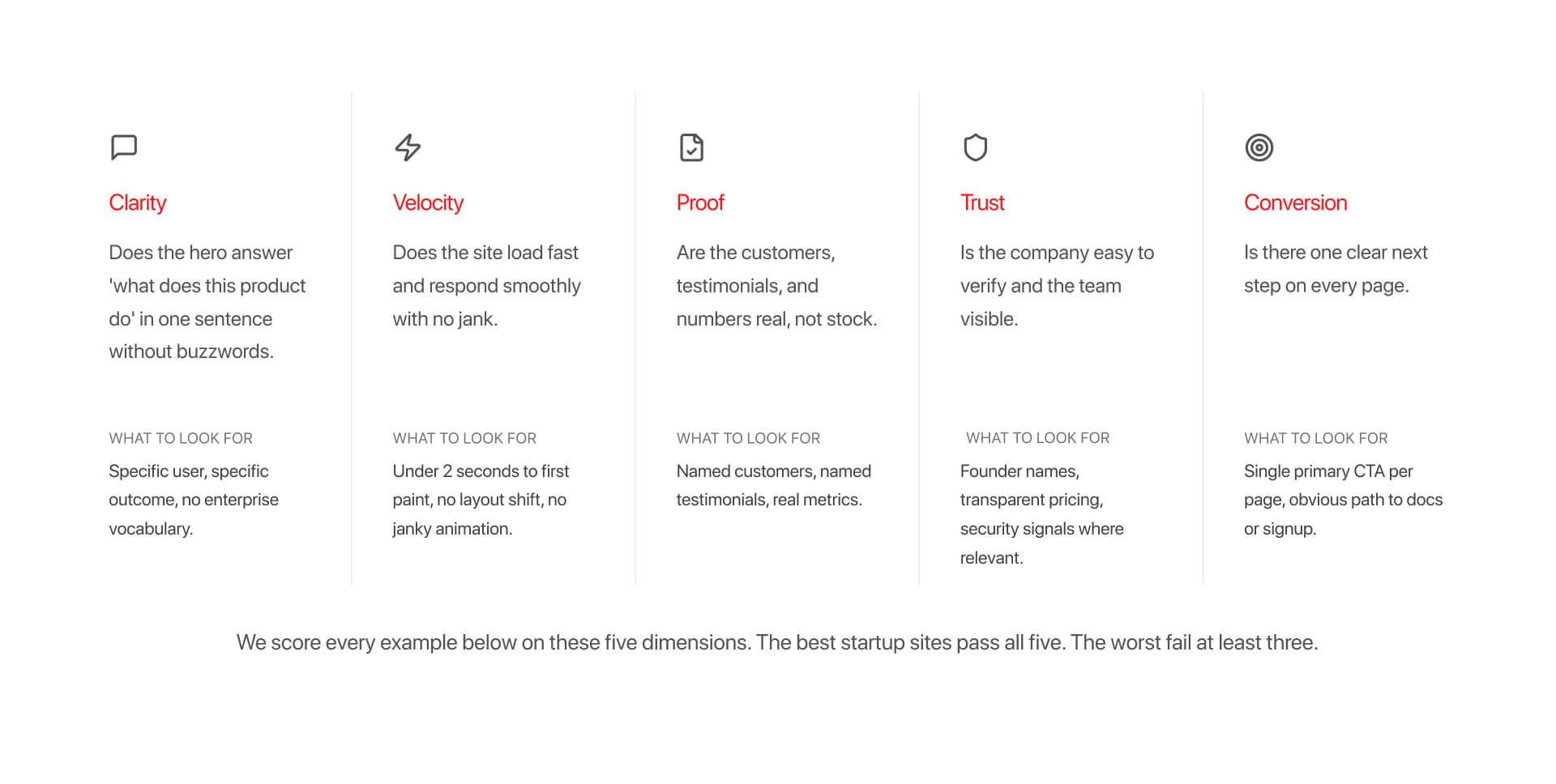
Clarity
Can the hero explain what the product does in a single sentence with no buzzwords? The best startup sites are painfully specific about the user and the outcome. Generic language can signal weak positioning.
Velocity
Does the site load quickly and respond smoothly, within the goal of 2 seconds, as reported by Venture Beat. Slow pages, layout shift, and over-designed animation destroys trust fast, particularly on mobile.
Proof
Are the testimonials, customer logos, and metrics real? Real customer names beat decorative social proof every time. Screenshots, live product previews, and transparent metrics outperform brand language.
Trust
Can the company be verified quickly? Founder visibility, pricing transparency, documentation quality, and security details matter, particularly in fintech and cybersecurity. This is where positioning and operational credibility overlap stand out.
Conversion
Is there one clear next step? The strongest startup sites reduce decision friction, with a simple process: Sign up. Start free. Read the docs. Book a demo. Weak startup sites bury the CTA beneath layers of navigation and vague language.
Examples below are scored against these five criteria, not against subjective design taste.
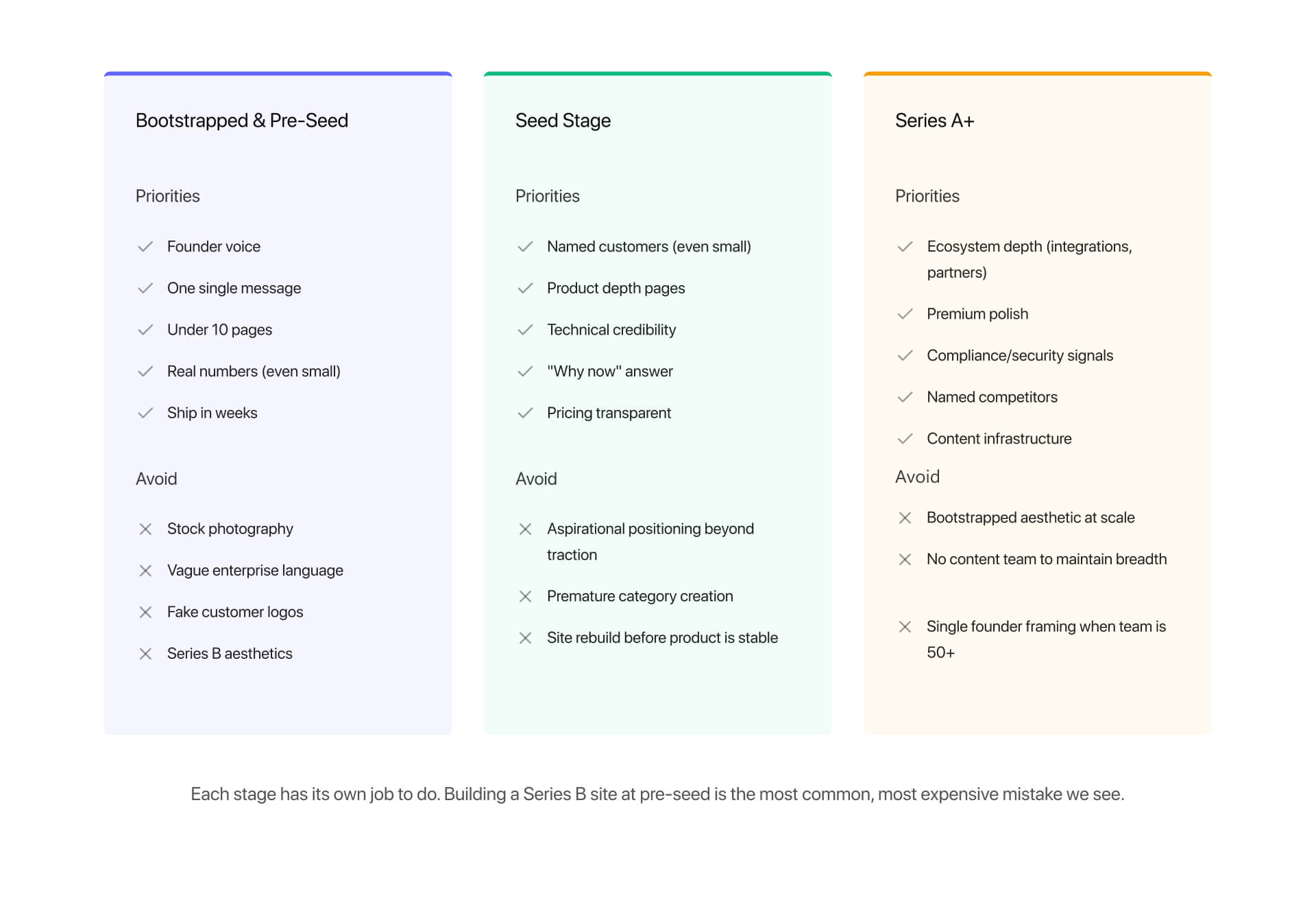
How We Organized This Guide: By Funding Stage, Not By Aesthetics
Most startup website roundups mix pre-seed startups with companies that have raised hundreds of millions of dollars. That makes advice less useful for founders trying to decide what to build right now.
A bootstrapped founder doesn’t need the same website as a Series B infrastructure company. The priorities differ, and so do the budgets, buyer expectations, and operational realities.
That’s why this is organized by funding stage instead of visual style.
We intentionally excluded companies like Stripe, Notion, and Figma from the main recommendations. Those companies operate with teams and resources, and infrastructure most early-stage startups are unable to replicate.
The purpose of this article is to show the most useful startup websites for the stage you’re actually at as a business.
Best Startup Websites for Bootstrapped and Pre-Seed Founders (3 Examples)
At this stage, your website is not a brand exercise. The goal is simple: explain what you do, show that it works, and give people a reason to try it.
What Pre-Revenue Startups Should Signal (and What to Avoid)
Pre-seed and bootstrapped startups win on clarity and honesty.
What this stage needs is simple: founder voice, build-in-public energy, a clear product description, and zero funding theater. The best sites at this stage feel personal. You can tell they were built by a real person rather than a marketing team looking to optimize.
It is important to avoid stock photography, as this signals you have no product yet. Vague enterprise language and positioning also signals weak thinking. Fake testimonials are also the fastest way to break trust.
The best move is to be specific, small, and human. Be honest if you have 10 users. Show if you are early. Clarity beats credibility theater every time.
This is even more important in security-conscious categories, where you achieve credibility by demonstrating early expertise. For this reason, Webflow for cybersecurity sites often emphasizes transparency and founder credentials from the start.
Pre-seed and need a site that ships in weeks, not months? Hedrick offers hourly Webflow help built for founders moving fast.
Recommended: Tella - Honest Hero, Founder-Led Story, Zero Funding Theater
Tella is a bootstrapped video creation tool that’s built in public by Pratham Mittal.
Its positioning is: “Make video like never before. Just record, no edits.”
That is the product, the action, and the outcome in less than 10 words. The site is deliberately small, with fewer than 10 pages. It’s fast and built around real product usage. Pricing is transparent - Free ($0/user/mo), Pro ($13/user/mo), Premium ($19/user/mo). The homepage uses real screenshots instead of abstract visuals, removing the guesswork from the user.
Framework score:
Clarity: 5/5
Velocity: 5/5
Proof: 4/5 (named testimonials from real users)
Trust: 4/5 (founder visible)
Conversion: 4/5 (clear “Start recording” CTA)
What to copy is simple. The hero formula works: action verb + product + result. Founder visibility helps build trust early, while keeping the site under 10 pages provides clarity.
Limitations are clear. As Tella grows, the site needs to evolve with it. What works at pre-seed won’t hold at Series A. What’s harder to replicate is the execution quality. The speed, animation smoothness, and interaction polish require real frontend discipline. This is where strong Webflow interaction work becomes noticeable.
Recommend: Plain - Founder Voice and a Single Powerful Message
Plain is a customer support platform built by a team with deep product experience. Positioned as “Customer support for tech-forward businesses.”
That single phrase does so much of the work.
The site comes across like it was written by its founders. It is specific, opinionated, and consistent. The design is minimal on purpose, which forces the copy to carry the experience.
Framework score:
Clarity: 5/5 (clear and specific positioning)
Velocity: 4/5
Proof: 5/5 (real customer quotes and logos, including Granola and Raycast)
Trust: 4/5 (founders visible, GitHub presence)
Conversion: 4/5 (clear demo CTA)
The key element here is to focus on specificity. A “tech-forward business” is not for everyone. But that is the point, and the best pre-seed sites narrow your audience instead of broadening it.
The limitation here is that this approach requires strong writing. High-quality copy is integral because without it, a minimal design feels empty. Most teams at this stage underestimate the importance of copy. The clarity behind your copy is one of the most challenging things to replicate.
Also Consider: Resend - Developer-First, Built by the People Who Use It
Resend is an email API built for developers, and is YC-backed, as confirmed on YCombinator.com.
Direct positioning: “The email API for developers.”
No abstraction. No translation required.
The homepage instantly indicates code samples, which is precisely what the audience wants. For developer tools, code is proof. It shows how the product works with no explanation.
The conversion path reflects this. There is no “book a demo” friction. The primary path is to explore docs and generate an API key.
Framework score:
Clarity: 5/5
Velocity: 5/5
Proof: 4/5 (named developer testimonials)
Trust: 4/5 (transparent pricing, founders visible)
Conversion: 5/5 (API key access in minutes)
The main takeaway is straightforward: make sure to show the product in the hero. Not screenshots. The true interface or output.
For developer audiences, this is the quickest way of being able to build trust.
The tradeoff here is technical complexity. Embedding live code blocks or dynamic product elements requires more than static design. This typically involves custom embeds and integrations. It’s here that Webflow integrations become necessary to connect product experiences.
Best Startup Websites for Seed Stage Founders ($1-10m Raised)
At seed stage, your website becomes a credibility layer rather than simply a clarity layer. You need to move from explaining an idea to proving that this idea works.
What Seed-Stage Startups Should Signal
Seed-stage startups sit in a difficult middle ground. You might be early, but you are no longer unknown. You’re going to be pitching to Series A investors, as well as being able to sell early to enterprise customers.
As a result, your site needs to be able to do two jobs at the same time.
First off, you need to be able to show traction. This can be small, and a handful of customers is plenty, as long as they are real and you name them. Anonymous logos and vague testimonials need to be avoided at this stage.
Secondly, you have to be able to show product depth. Visitors should be able to understand what a product does, as well as how it works. Most seed-stage sites fail at this point; they stay too high-level and don’t move beyond positioning.
Third, it has to answer the “why now?” question. Why does this product exist today, and why does that matter? This is crucial because it is what investors and early adopters both look for.
This is important for B2B SaaS startups, where sites have to balance product depth with early credibility.
At seed stage, the site carries real weight, and it needs to reflect traction. This is where Webflow for B2B SaaS teams becomes useful, allowing teams to showcase genuine product depth, without overpromising scale.
Recommended: Cal.com - Open Source as Brand Position
Cal.com makes its position clear right off the bat: “The open source Calendly successor.”
This is a positioning decision rather than a feature. And the entire site design reinforces these ideas. Open source acts as the moat. Transparency is the trust signal. The site leads with philosophy instead of features.
This is plain to see in the proof layer. Rather than relying on logos, Cal.com uses GitHub stars (40K+) as social proof. For this audience, that signal is stronger than most enterprise branding.
Framework score:
Clarity: 5/5
Velocity: 4/5
Proof: 5/5 (GitHub stars, named users)
Trust: 4/5 (open source transparency, founders visible)
Conversion: 4/5 (clear free signup and self-host paths)
The key takeaway is to lead with positioning instead of features. Open source defines the product before the product is explained.
However, there are obvious limitations. You can’t copy this unless it’s real. Open source needs to be a company decision as opposed to a design choice. Trying to replicate this with no substance will immediately break the trust.
Execution detail is much harder to replicate. The subtle motion, transitions, and interaction quality reinforce the product’s modern feel. That’s where Webflow animation services become more noticeable, because even small interaction details can shape how credible the product feels.
Recommended: Browserbase - Technical Depth Without Jargon Wall
Browserbase is a great example of a seed-stage site that goes deep instead of being unreadable.
There is direct positioning here: “Headless browser infrastructure for AI agents at scale.”
This is specific to the user, as opposed to generalizing. It speaks directly to people building AI agents.
The site manages to back this up with product depth. Code samples and clear pricing illustrate how the product works; it doesn’t rely on explanation alone, but instead shows the system.
Framework score:
Clarity: 5/5
Velocity: 4/5
Proof: 4/5 (named customer logos, including Microsoft, Clay, and Amplitude)
Trust: 4/5 (founders visible, in-depth security page)
Conversion: 4/5 (free trial path)
The core lesson to learn here is specificity. Narrow positioning is not a limitation, but is a signal that the product understands its audience. Limitations are very clear here: the approach only works if the niche is real, and your positioning is clear and concise.
What’s more difficult to replicate is the way the product connects to the remainder of the site. Showing actual technical workflows often requires deeper system integration. This is where Webflow integrations matter, especially when it comes to connecting product data and architecture visuals.
Recommended: Trigger.dev - Show the Product, Do Not Just Describe It
Trigger takes a different approach to the same issue. It shows the product instead of merely describing it. The hero embeds a live product preview, showing the actual interface, and not just a screenshot or a video.
This is one of the strongest trust signals you can create for developer tools.
Framework score:
Clarity: 5/5
Velocity: 4/5
Proof: 5/5 (live product, named users)
Trust: 4/5 (open source, founders visible)
Conversion: 4/5 (clear signup and self-host paths)
The takeaway here is clear - show the product wherever possible. The closer the user gets to the real interface, the more quickly you’re able to build trust.
The limitation here is performance. Live embeds that load slowly or break end up destroying the trust they’re meant to create. Execution is more important than intent.
The technical integration is difficult to replicate, not least because embedding live product experiences into a CMS-driven site needs careful setup. It is here that Webflow integrations matter most, particularly when they help connect real product environments with marketing pages, while maintaining performance.
Best Startup Websites for Series A+ Founders ($10m+ Raised)
By this stage your website no longer operates as a conversion layer. It becomes part of your sales motion, brand, and product ecosystem.
What Growth-Stage Startups Need to Demonstrate
Series A+ startups operate in a different environment. You are now trying to prove the product scales, as opposed to proving that it works.
This alters what your website needs to be able to communicate.
The first thing you need is ecosystem depth, including integrations, customer logos, and partner pages that genuinely mean something. Your site needs to work for decision-makers, users, and technical evaluators at the same time.
Secondly, you need to have design polish. Not because of aesthetics, but due to trust. At this level, rough execution means operational risk. Buyers expect speed, consistency, and attention to detail.
Thirdly, compliance and credibility signals are essential, especially in fintech and security. These are not optional, they are absolute requirements.
Finally, you have to have positioning. This is not just about what you do, but about how you compare to alternatives. This helps shift your site from explanation to competition.
This is also the stage where most teams outgrow simple tooling and require enterprise-level infrastructure.
At Series A+, the site goes from being a marketing layer to becoming part of the product and sales system. If your current setup is starting to break, and you need enterprise-level support, this is where Hedrick Enterprise becomes crucial.
Recommended: Linear - The Premium Standard for Modern B2B SaaS
Linear is what a Series A+ SaaS site looks like when design, product, and positioning are fully aligned.
The company is a Series C startup that has raised over $200m, and the site reflects that level of maturity.
The site has direct positioning: “The new standard for modern software development.” There’s no hedging in this statement. It is full of confidence and intention.
Linear has helped to define the visual standard for B2B SaaS from 2024 to 2026. Everything on the site supports this claim. Dark mode is default. Motion is subtle and controlled. Illustrations are custom-built. The site feels cohesive, with every element serving as part of the same system.
Framework score:
Clarity: 5/5
Velocity: 5/5 (high Lighthouse performance scores)
Proof: 5/5 (named high-growth customers visible on-site, including OpenAI, Coinbase, and Ramp)
Trust: 4/5 (transparent pricing)
Conversion: 5/5 (free signup with seamless upgrade path)
The most important takeaway here is discipline. Each of the pages communicates a single idea clearly. There is no attempt to stack multiple messages, and this restraint gives the site a premium feel.
The limitation that exists here is cost and maintenance. This level of polish is not achieved by a single redesign, but, instead by an ongoing investment in design systems, motion, and content. This is where Hedrick becomes crucial, helping sustain this quality as a continuous process.
It’s the system that becomes the hardest to replicate here, not the layout. Interaction consistency, motion timing, and illustration language require dedicated ownership. When this is lacking, the structure becomes generic.
Recommended: Mercury - Trust Without Bank Aesthetic
Mercury is a great example of how fintech startups are able to communicate trust without defaulting to outdated design conventions.
The company is a Series C startup that has raised more than $300M, and the website reflects the expectations that come with a regulated category.
The positioning is clear and direct: “Banking for startups.”
This clarity matters more in fintech than practically any other category, because users have to understand what the product is and if it applies to them pretty much immediately.
Challenges here include being able to balance trust and usability. Traditional financial websites tend to rely on dense layouts, legal-heavy language, and reserved design. Mercury manages to avoid this completely, and uses strong typography and modern layout, with clear structure, while still embedding the signals users need to maintain trust.
Framework score:
Clarity: 5/5
Velocity: 4/5
Proof: 5/5 (real customer logos visible on-site
Trust: 5/5 (FDIC partner banks - Choice Financial Group, and Column N.A., Members FDIC)
Conversion: 5/5 (fast onboarding)
The key takeaway here is how trust is integrated into the experience. It’s not isolated in a footer or hidden behind legal pages. Instead, it appears throughout the site in context, to provide greater reassurance to users.
This is crucial for fintech startups. Trust isn’t a single section. It functions as a system that spans product design and content. Webflow for fintech is so relevant because the site has to support conversion goals and compliance requirements without sacrificing either.
Complexity is the limitation here. The compliance layer behind the site is substantial. Regulatory disclosures, banking partnerships, and operational constraints all impact what can be said, and how it’s presented.
The integration approach is worth copying here. Trust signals are embedded directly into the design instead of being treated as an afterthought. This gives the site credibility without being outdated.
Recommended: Vercel - Product-Led Through and Through
Vercel is a clear example of what a fully product-led site looks like at scale. The company is an E Series startup that’s raised more than $300M, and the site maturity sees product and website tightly integrated.
Execution stands out. The homepage illustrates the product. Workflows, interface previews, and outputs are instantly visible, reducing the gap between understanding and usage.
Navigation reinforces this. Documentation serves as the primary entry point. Documents are the conversion path for Vercel’s audience.
Framework score:
Clarity: 5/5
Velocity: 5/5 (Vercel runs on Vercel, fastest in this set)
Proof: 5/5 (extensive customer logo grid)
Trust: 4/5 (transparent pricing, security page, founders visible)
Conversion: 5/5 (deploys in 2 minutes)
The key takeaway is prioritization. The site is built around usage rather than explanation. Every decision reduces friction between landing on the site and using the product.
The docs-first approach is worth copying. For developer tools, documentation is the core interface for evaluation and adoption.
At this level, limitation is the scale. The website is an ecosystem that includes product surfaces, content, documentation, and community. Dedicated content and engineering resources are necessary to maintain this.
It’s tough to replicate the product and marketing integration, but the site works because it links so closely to the product experience. Without that connection, product-led culture ceases to be effective.
5 Common Startup Site Mistakes, Why We Build on Webflow, and Stage-Based Reference Stacks
Most founders need fewer mistakes above anything else. This section is focused on the most common mistakes startup sites make, and what can be done to fix them.
The 5 Mistakes We See on Almost Every Startup Site
We audited 50+ startup sites, and found the same five mistakes continually appearing. All of them are fixable.
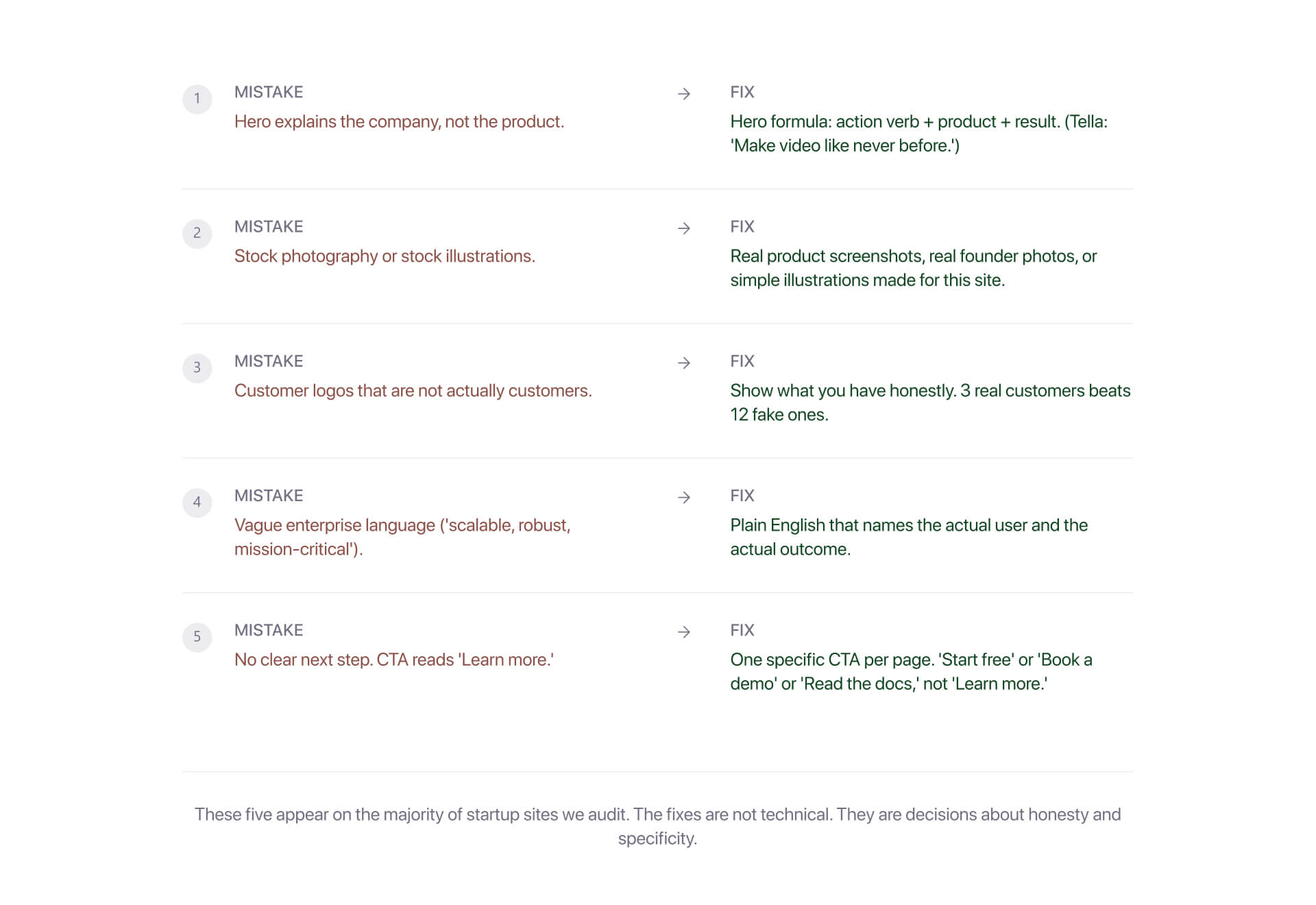
1. The hero explains the company, not the product
Your hero might sound ambitious, but more often than not it doesn’t tell the reader anything.
The fix is to adopt an easy formula - action verb + product + result. The user must be able to understand exactly what you do (and what you can offer) in a single sentence.
2. Stock photography and illustrations
If you use these, users are able to tell immediately. It suggests there isn’t a real product or usage to show.
The fix is to use product screenshots, real UI, and simple custom visuals. Even rough real visuals perform better than polished stock visuals.
3. Customer logos that aren’t real customers
Including pilot users and “friendly” logos as proof breaks trust quicker than not having any logos at all.
The fix is that you need to be honest about what you have. Three genuine customers is far stronger than 12 weak ones.
4. Vague enterprise language
Using words like “scalable,” “robust,” and “mission-critical” are typically used instead of providing clarity.
The fix is to replace abstract terminology with greater specificity. Make sure your name the user and the outcome. Plain English always converts better than using inflated language.
5. No clear next step
“Learn more” does not work as a CTA. It actually creates friction instead of reducing it.
The fix is to have one clear action per page. Start free. Book a demo. Read the docs. The next step in the process should be clear and obvious.
Why We Build Startup Sites on Webflow
Hedrick is a Webflow Enterprise Partner. Most VC-backed startups we work with choose Webflow for one key reason: it matches the way startups operate.
1. Iteration speed
Founders can test messaging, adjust pages, and ship updates without reliance on engineering. Early in the process, speed is more important than perfect architecture.
2. Performance
Webflow sites achieve strong performance out of the box. Lighthouse 90+ is achievable with discipline and structure. This directly impacts SEO and conversion, and is a key reason why Webflow for SEO often becomes part of the decision at this stage.
3. Integration Ecosystem
Webflow fits naturally into the typical startup stack: HubSpot, Segment, Customer.io, Stripe. The site isn’t separate from growth at this stage, it’s part of it. That’s why Webflow marketing strategy matters, because the site connects directly to acquisition, retention, and onboarding.
There are also alternative options:
- Framer is ideal for design-led teams looking to move fast
- Next.js + custom works well for engineering-heavy products
- Squarespace works for simple use cases
However, the takeaway here is that Webflow is a great choice because it aligns with the way startups test, grow, and iterate.
Reference Stacks by Funding Stage
Most startup sites fail because the stack doesn’t match the stage. There’s a tendency for teams to overbuild, and then find it tough to maintain what they’ve launched.
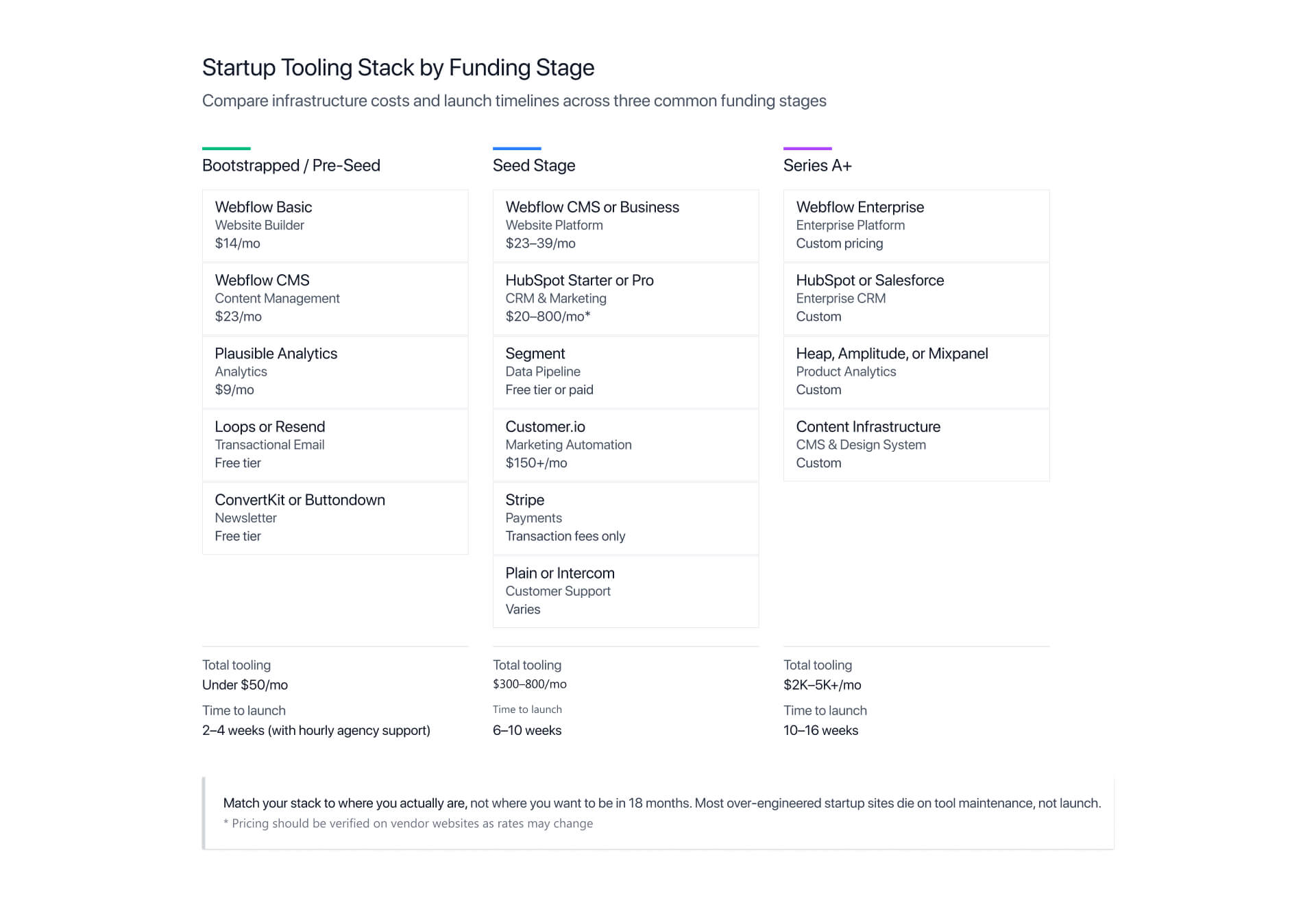
Bootstrapped/Pre-Seed
Keep it simple.
- Webflow Basic ($14/mo) + CMS ($23/mo)
- Plausible Analytics ($9/mo)
- Loops or Resend (free)
- ConvertKit or Buttondown (free)
Total: Under $100/mo
Launch time: 2-4 weeks
If you need support, this is where Hourly Webflow help can be a better fit than a full engagement.
Seed Stage
Add structure and integrations.
- Webflow CMS or Business
- HubSpot Starter or Pro
- Segment
- Customer.io
- Stripe
- Plain and Intercom for support
Total: $300-800/mo
Time to launch: 6-10 weeks
Site rebuild every 12-18 months, after sharpening positioning. By this stage your site can support numerous workflows, including onboarding, acquisition, and early sales.
Series A+
The site becomes an ecosystem.
- Webflow Enterprise
- HubSpot or Salesforce
- Advanced analytics (Heap, Amplitude, Mixpanel)
- Content infrastructure and design
Total: $2K-5K/mo (ongoing investment with quarterly iteration cycles)
Time to launch: 10-16 weeks
This is where Hedrick Enterprise becomes the right engagement model, helping move the site from a one-time project, and shifting the work from building to maintaining.
Choosing the Right Approach for Your Stage
Choosing the correct approach for your stage is essential for ensuring your website is doing its job, and one of the biggest mistakes founders often make is building for the wrong stage.
Quick Reference: What to Build at Your Stage
Each stage fulfills a different function and purpose.
Bootstrapped/Pre-Seed
The focus here is on clarity, with a strong founder voice, singular message, and a site of under 10 pages. Ship fast. The goal here is understanding.
Seed Stage
Add proof and depth. Ensure you showcase real customers and genuine product workflows. Answer the “Why now?” question, and give visitors a reason to be invested. The goal here is credibility.
Series A+
Build for scale. This means integrations, ecosystem pages, compliance signals, and content infrastructure. Your goal here is to support multiple buyers and numerous use cases.
If your site isn’t doing the job of your stage, it’s going to underperform, no matter how good it looks.
Where to Start (and Where Most Founders Get Stuck)
Most founders find difficulties when trying to build a Series B site at the pre-seed stage. Often they will look at Linear and try to replicate it, but Linear earned its status over years, and hundreds of millions in funding. It should not be treated as a starting point.
Simplicity is the best approach. Build the smallest possible version of your site that communicates concisely and with clarity. Then use the opportunity to iterate as your company starts to grow.
The stacks outlined above are designed to help you where you are right now, and not where you hope to be 18 months down the line.
If you’re at seed or Series A and you’re ready to invest in a site that matches your stage, Hedrick builds these on Webflow every day. See how Hedrick is a core part of the VAN network team to find out more.
FAQS
What makes a good startup website in 2026?
In 2026, a good startup website will pass five core tests: clarity, proof, trust, velocity, and conversion. The most successful sites explain the product quickly, build trust, load fast, and show real proof, providing a single, clear next step.
What should I include on my startup’s homepage?
Include a clear hero, product screenshot, genuine proof, clear CTA, founder visibility, and a path to learn more. Avoid stock visuals and vague positioning, which cheapen credibility.
How long should a startup website be?
Pre-seed sites typically need 5-10 pages, seed-stage sites often need 10-20, while Series A+ sites might even need 20-50+. Don’t build pages your team can’t maintain.
What platform should I use for my startup website?
Webflow is a strong choice for VC-backed startups due to its balance of design quality, integrations, and performance. Framer is better for design-led teams, while custom Next.js is ideal for engineering-heavy teams.
How much does a startup website cost?
It depends on the stage that your website is at. Bootstrap sites range from $0-3K, seed-stage rebuilds come in at around $15K-40K, and Series A+ can reach as high as $40K-100K. Overall, the cost depends on custom design, strategy, and copy development.
Should I show pricing on my startup site?
Yes, unless every deal involves custom pricing. Regardless, showing a starting point helps to develop trust and reduce friction.
What’s the difference between a pre-seed and a Series A startup website?
Pre-seed needs to communicate one thing clearly, and quickly, with founder voice. Conversely, Series A sites require named customers, security pages, ecosystem depth, and multiple buyer paths.
How do I show traction on my startup site if I’m pre-revenue?
Be transparent about what you have. Even small real proof - including beta users, GitHub stars, founder credentials, and investors - is stronger than inflated claims.
What are the most common startup website mistakes?
The most common startup website mistakes are fake logos, wordy enterprise language, vague heroes, weak CTAs, and building a growth-stage site too early. Address this problem by making the site smaller and more specific.
How long does it take to build a startup website?
A bootstrap site takes around 2-4 weeks, a seed-stage site is generally closer to 6-10 weeks, while a Series A+ site can take as long as 10-16 weeks.
Don’t treat a startup site like a brochure, it’s your first hire that never sleeps.
The leading startup websites match the stage your company is actually at, not the one it plans to be at 12-18 months down the line. Many underperform because they’re built too early for a stage the company is yet to reach.
If you want an expert opinion on where your site actually sits, talk to Hedrick, and check out our Webflow web design capabilities.

Related articles
Read more
Read more
Read more
Hire Hedrick, Your Webflow Sidekick
Whether it's developing new websites and landing pages, building complex animations, integrating apps, or adding some custom code – if it's related to your Webflow site, we can help!
.webp)
The Webflow Toolkit
.webp)